How Do I Choose a Color for Coloring Pages?
Expert Tips and Examples Choose a Color for Coloring Pages
1. Start with the Mood You Want to Create
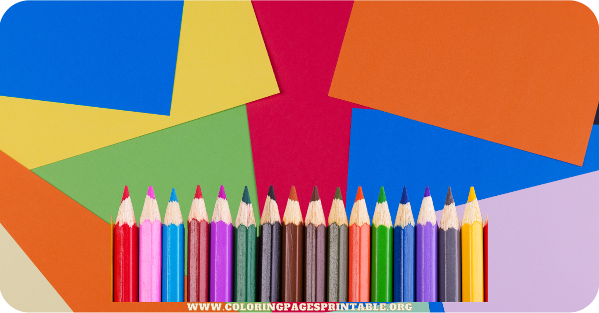
Colors are powerful tools for evoking emotions. When choosing colors, ask yourself: What feeling do I want to express?
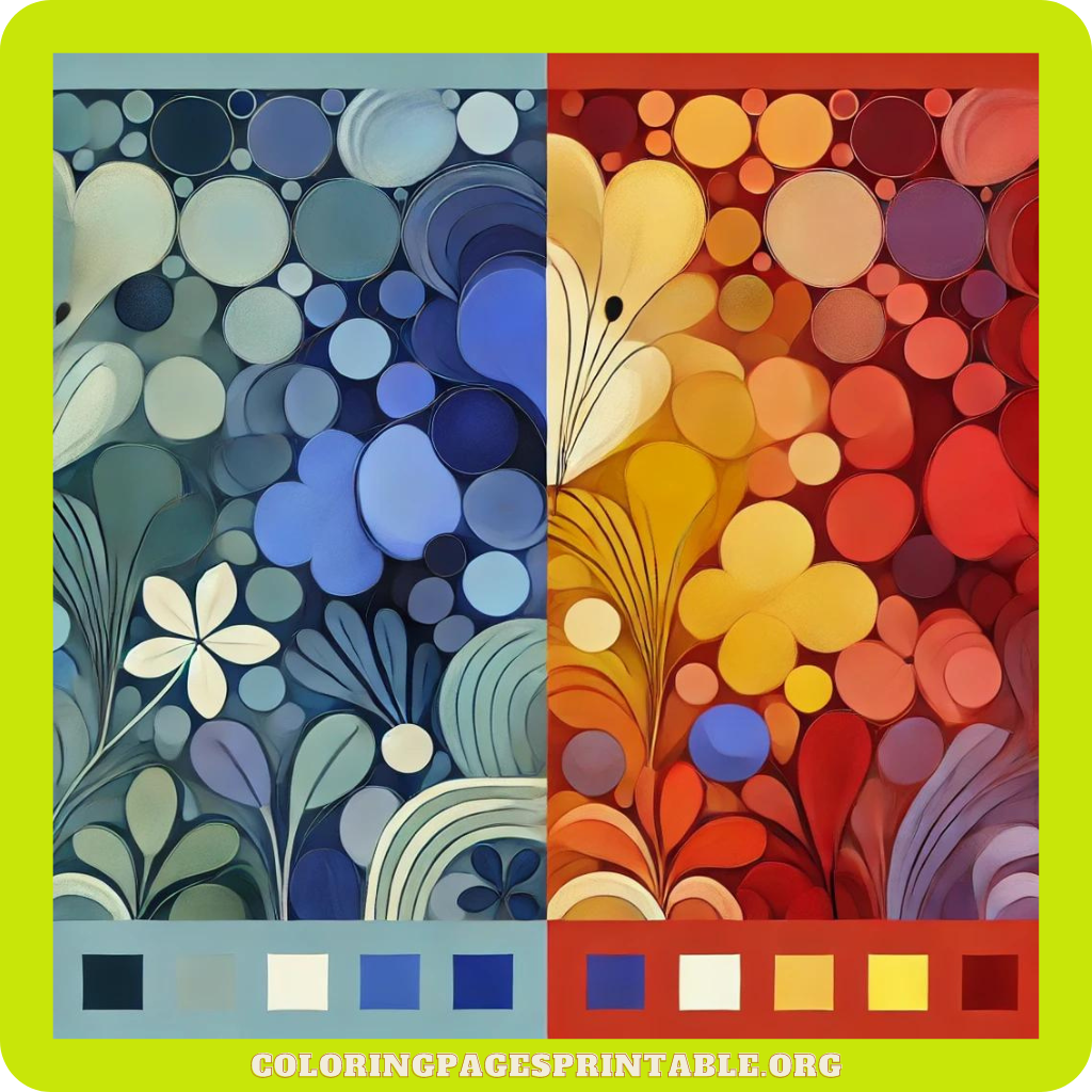
- Calming and Relaxing: If you’re aiming for a peaceful, zen-like coloring experience, opt for cool tones like soft blues, gentle greens, or light purples. These colors are often associated with calmness and tranquility.
- Energetic and Bold: If you want your page to feel vibrant and lively, go for bright reds, oranges, and yellows. These colors evoke energy, excitement, and positivity.
- Balanced and Harmonious: For a balanced approach, you can use a mix of warm and cool tones, creating contrast and harmony in your designs. Earthy browns, beiges, and pastels are perfect for grounding your image.
2. Use the Color Wheel
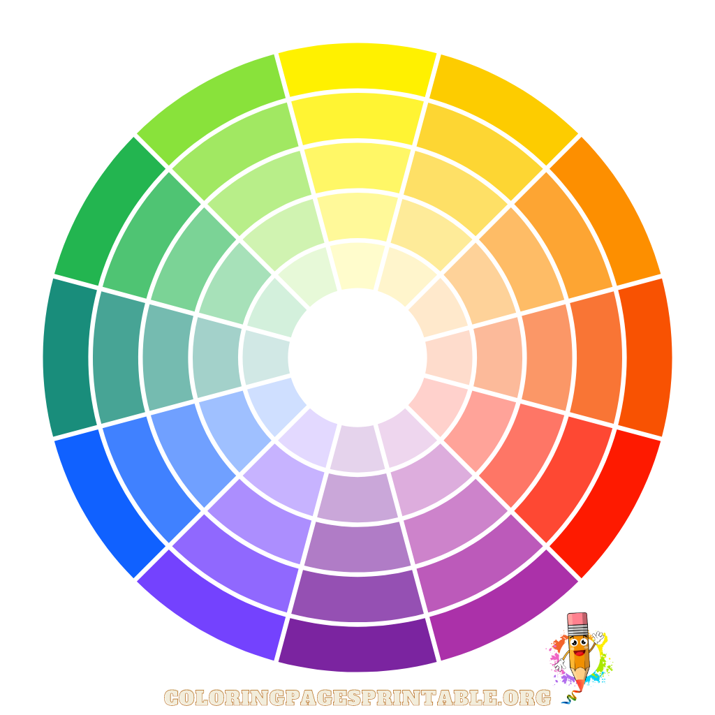
A color wheel is your best friend when it comes to picking complementary colors.
- Complementary Colors: These are opposite each other on the color wheel (like red and green, blue and orange). Pairing them can create a vibrant, eye-catching contrast that makes the artwork pop.
- Analogous Colors: These are next to each other on the color wheel (such as blue, teal, and green). Using analogous colors provides a more harmonious, soothing look, ideal for creating gradient effects or blending.
3. Consider the Theme of the Coloring Page
The theme or subject of the coloring page should also guide your color choices.
- Nature-themed Pages: For nature-related coloring pages, such as landscapes, animals, or plants, try to stick to natural colors—greens, browns, blues, and subtle shades of yellow or red. Of course, feel free to get creative and break the rules by adding vibrant pops of unexpected color.
- Fantasy-themed Pages: If your coloring page features fantasy elements like mythical creatures, castles, or magical settings, go wild with imaginative color choices—neon colors, glittery golds, silvers, and otherworldly purples can make these pages feel fantastical.
4. Experiment with Light and Shadow
One of the easiest ways to make your coloring pages look more professional and visually engaging is by incorporating shading and highlights. You don’t have to be a trained artist to do this!
- Start with a base color, and then use a darker or lighter shade to add depth and dimension. For example, when coloring a flower petal, start with a medium pink and use a darker red for the shadows and a lighter pink or white for highlights.
- Blend the colors gently with colored pencils or markers to achieve a smooth transition between shades.
5. Test Your Color Choices on Scrap Paper
Before committing to a color scheme, it’s always helpful to do a little test run on scrap paper. Swatch your colors to see how they look together. This step will help you avoid any clashing combinations and make sure the colors look as vibrant (or subtle) as you intend.
6. Use Color Gradients for Depth
If you’re coloring something that needs a little extra depth—like a sunset, an ocean scene, or even a tree—using color gradients can bring your artwork to life. Start with a light color at the top and gradually move to darker shades at the bottom. This technique works well with watercolors or colored pencils, allowing you to blend smoothly.
7. Trust Your Gut and Be Creative!
Sometimes the best coloring comes when you throw the rules out the window and simply color based on what feels right. Your personal preferences, favorite colors, or even your mood that day can dictate what your artwork will look like. Coloring is all about creative freedom, so don’t be afraid to experiment with bold combinations or colors that might not seem to “go together” at first glance.
